This was the first time I’d been a part of a team doing an animation. “Smooth Moves”, written by Biago Guagliardo. My professor, John McCaffrey, asked me during my storyboarding class if I’d want to take a swing at the Advanced Animation course, where the goal of the class was to create a short film. I found it a bit odd considering I hadn’t taken the regular Animation class yet. But I decided it sounded like a fun time.
It’s about a robot that comes to life and… turns evil? but not really? It’s kind of a misunderstanding? I’m not sure if anyone really knew what the point of it was. We knew our scenes and what the characters were supposed to do but I think at the end of the day we just wanted to animate a robot, because that sounded fun, not that I’m disparaging that. It was better than my idea, “Snake Girl”. I still get shivers thinking about that team reading my half baked script that came from a video game character idea I had been pondering recently. I didn’t do the obvious thing and script out a basic fight scene and instead went for her origin story ultra condensed into 2 pages because that was how long the short was supposed to be. Bleh…
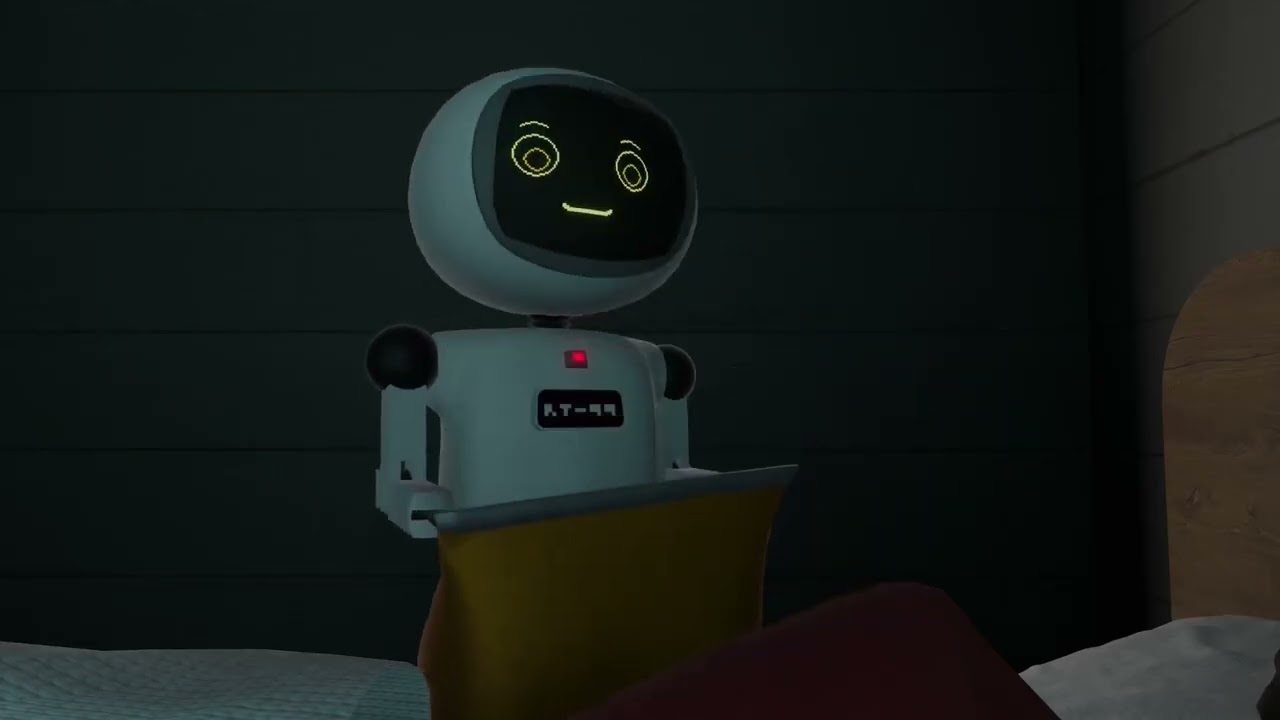
I was lucky enough to get the job of creating the robot and the rig. Although the earliest designs came from Scott Murray. Who slightly based his original design on the “Omnibot” robots featured on LGR recently at the time. It was a good tip off he was a fellow fan and he was a fun dude to nerd out with. I tried to combine his more old school design with a more expressive futuristic design with a screen for a face, while still keeping some retro aesthetics such as vacuum tubes and a general space age look, a badge with a hyper pixelated logo, etc.
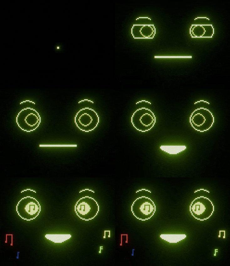
The first thing I did for the project was make a screen. Doesn’t sound too difficult or involved, and really it isn’t, just tie a texture to an emission material. But I wanted to go a bit further and give it an LCD screen with pixels that realistically outputted RGB from their respective lights. I did this with some pretty basic Blender material magic, just separating the RGB colors into 3 separate passes, and having those light up the specific lights on a flat texture of an LCD screen, but it created a very nice realistic looking screen effect. Especially in Cycles, which we unfortunately didn’t end up using, it would light up the cheap see through plastic of the face of the robot and create a very realistic looking smeary look. Then I did some basic pixel art for the face.

My scene to animate was the bedroom scene, after hours, the robot goes rogue and does it’s own thing. I really enjoyed focusing on a lot of little details. Making it bounce off the floor, find interesting ways to climb up areas, swing a door open and let the force from that spin it’s whole body around. I wanted to give the robot a physicality and give the scene an almost slapstick appeal. When we screened the short and some of my moments got reactions out of the rest of the team, that felt insanely good.
I think a lot of us took pleasure in animating the little guy and getting really granular with it, the short which was originally supposed to be about 2 minutes is in actuality about 5 and while obviously a lot of our first experiences on a project like this, you can kinda pick out who’s scene is who’s through stylistic choices. We all got really indulgent.
I was really sad most of the team was graduating while I was so new, because I had such a fun time working with them. They were more experienced with script writing, video production, etc. while I was more experienced in Blender, and that created a very fun dynamic. Hope you all are doing well, wherever you are.
